Cooking Up Luxury: Veneta Cucine’s Premium Kitchen Collections

Whether the timeworn splendour of Venice or the rustic charm of Tuscany is preferred, the colours of Italy should inspire the kitchen in your home. It is known to the world that the elegant Italian paint colours are rich and relaxed, thus famous worldwide. They not only warm up your kitchen but also, at the same juncture, make it feel homey as well. Plain latex portrayed by wearing an Italian style mesmerizes all. If you want an authentic-looking, aged plaster look, then go for layering the colour that will appeal to all and sundry. Below listed are some colours that will give a refreshing look to your kitchen.
Terracotta: Perhaps no other colour epitomizes Tuscany like the rusty orange of Terracotta does. The bloom emerges from the baked clay tiles and cooking crocks. Painted cabinetry and natural wood stains are complimented well by the Terracotta walls. The accents of gold, mediterranean blue and shades of green ranging from pear to brown get mixed well by terracotta and look fantastic. If you want to give a fiery effect, you can combine terracotta with warm red as a combination colour scheme.
Tomato: If you clamour for a red kitchen’s energy, you better opt to create a rustic Italian feel with red tomato paint. It will give rise to a warmer and earthier look than you’d get with the blue-based reds. Tomato and other brown or orange-based reds provide a rich enough look with their deep, rich wood shades alongside the most natural stone colour scheme. For the classic Tuscan style, tomato red with gold and pear green can be perfectly mixed.
Pear or Olive: Choose your favourite between the two or use them together, particularly those evoking the casual, earthy feel of Tuscany that will bring alive before you Sun-kissed yellow-greens from pear to olive Italian inspired kitchens. Pear helps brighten a kitchen that doesn’t have much natural light as a wall colour. On walls or painted cabinetry, neutral olive works well. Mixing pear and olive with accents of terracotta, gold, plum, and brown-based burgundy gives rise to a captivating colour rich enough to offer your kitchen an entirely new lease of life.
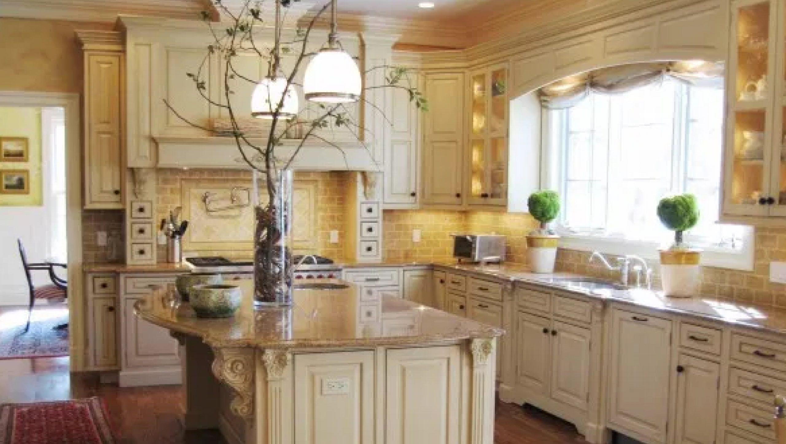
Gold: From the sophisticated gilt of Venice to the sun-drenched shades of the countryside, gold is a classic paint colour choice for any Italian kitchen. A hint of metallic sheen to the paint can be added for city-style, whereas for country appeal, golds that range from the deep ocher to a bright sunflower as a better option to choose. A gold-painted kitchen provides a neutral background for more brilliant accessories and colours. Gold pops up with red, cobalt blue, turquoise and plum though it mixes well with nearly any colour.
Plum or Purple: Plum and purple shades are found throughout Italy—whether it is the regal appointments of Venice or the lavender fields of Tuscany. Against the medium to dark natural wood finishes on cabinets, plums and purple look rich, and they complement most natural stones used for countertops and tiles.
Each colour has its own charm and appeal like combining plum-or purple-painted walls with the accents of metallic gold, garnet red, and mediterranean blue provides a sophisticated Venetian-inspired look. Mix it with sunflower yellow, terracotta, and olive to weave a rustic look.